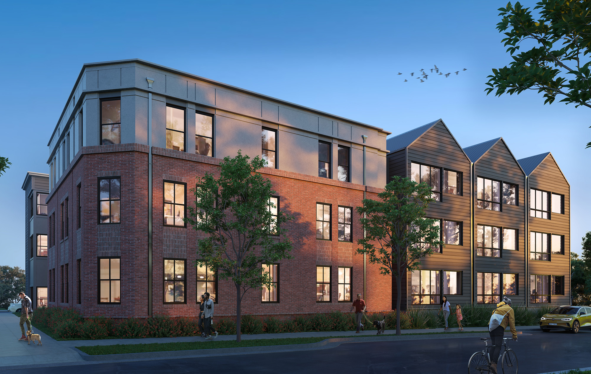
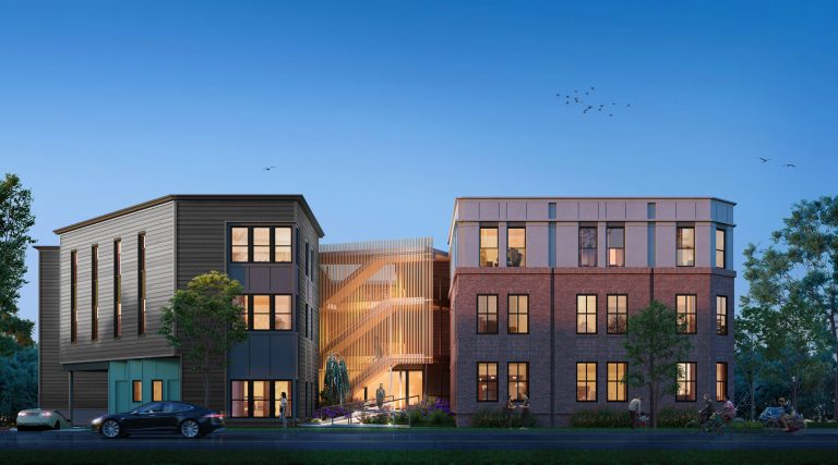
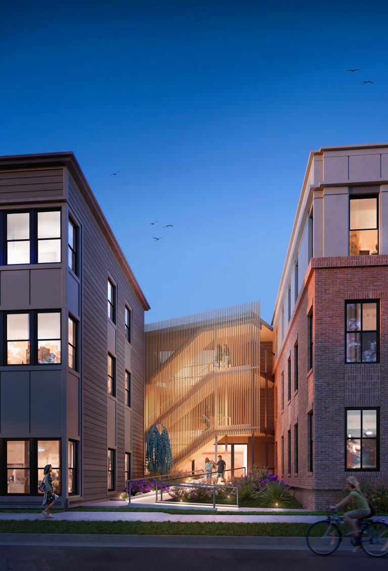
Our multi-family residential project on Seigle Ave in the Belmont neighborhood focuses on elevating kick-ass design while fitting in with the existing scale of the neighborhood. We worked with the aesthetics of historic Belmont to design a building massing that appears to be a collection of smaller buildings with a lower scale, rather than a larger, more imposing structure. In that vein, instead of one big wall, there are smaller entrances and exits and changes in the sculptural shape that fit in with the established character of the neighborhood.
As Charlotte grows, so does the need for housing that is cool and conducive to the needs of urban dwellers. A majority of the 28 units are two-bedroom apartments, so we had to be thoughtful about the need for proactive parking solutions, as well as cyclist and pedestrian-friendly details. These efforts can be seen most clearly in our one-bedroom affordable units, the below-ground parking deck, and our covered walkways between buildings. Additionally, for each two-bedroom unit, there will be a parking stacker that allows for cars to be parked on top of each other. This greatly reduces the footprint of the building, and allows for more space to roam on foot. And speaking of walking, this project allows for several different types of access to the adjacent greenway.
Every architectural project remakes the city in big and small ways, but we are optimistic about the direction in which we are going. As Charlotteans, we know that change is inevitable, but Cluck strives to bring about change in a way that will improve upon the ideas that make our neighborhoods so unique.
—
Renderings: @maqerendering

